Lundquist Built icon
LUNDQUISTBUILT
Lundquist Built iconLUNDQUIST BUILT
Homes · Remodels · ADUs · Pools

Refined coastal residential construction. Cost-plus, transparent, made to endure.

Brand assets and guidelines for Lundquist Built Inc. — last updated May 2026

Brand story

Who we are, what we believe, how we work.

Who we are

Lundquist Built Inc. is a California licensed general contractor (CSLB #TBD) based in San Clemente, building refined residential projects across coastal Southern California — homes, remodels, ADUs, pools. The company is owned by Blake Lundquist, who brings fifteen-plus years of construction experience and a design-forward sensibility to every project.

What we believe

Construction shouldn’t be opaque. Our cost-plus model means clients pay exact project costs plus a transparent 20% margin (1.25× multiplier) — no padding, no hidden markups, no fixed-price contingency buffers. You see what we see, including contractor pricing on subcontractors and materials.

How we work

We take on a small number of projects each year so every one gets the attention it deserves. We move at the pace of craft, not the pace of schedule. Our standard isn’t “good enough for the timeline” — it’s what we’d build for our own family.

Color palette

Four colors. True black, true white, and quiet accents.

True black and white because Lundquist Built is a construction brand — vendor-friendly across substrates (embroidery, screen print, vinyl, vehicle decals). Refinement comes from typography and composition, not from softening the black. Click any swatch to copy its HEX.

Color pairing rules

  • Logos on Warm Cream background → use Black (primary) or Workshop Navy (alternative)
  • Logos on White background → use Black (primary) or Workshop Navy (alternative)
  • Logos on dark backgrounds → use White (reverse)
  • Avoid placing the logo on non-palette background colors
Typography

Two type systems. The wordmark stays sacred. Everything else reads in Fraunces & Inter.

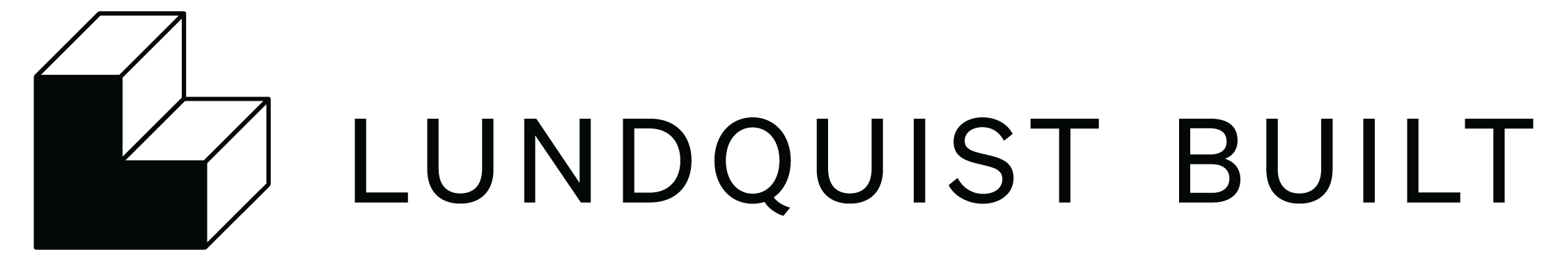
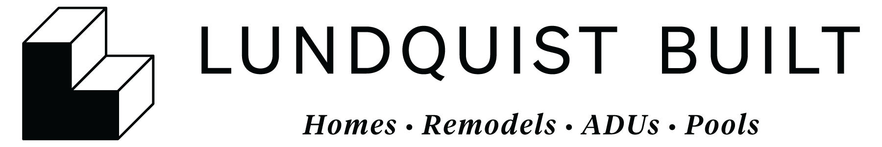
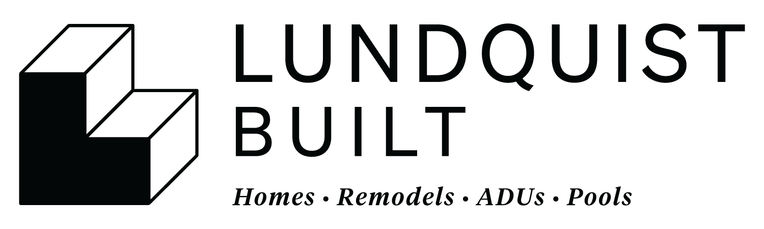
Söhne Buch and Tiempos Headline Italic are the wordmark fonts — they appear in the logo lockups and nowhere else. For body copy, page headings, marketing material, and signage, use Fraunces and Inter. Same pairing Lundquist Surfboards uses; the shared system creates implicit family connection across Lundquist Inc. brands.

Tier 1 — Wordmark fonts

Locked to the logo

Söhne Buch and Tiempos Headline Medium Italic appear inside the logo SVGs and tagline lockups only. Never reach for them for body copy, page headlines, marketing material, or any other typographic surface. They are licensed assets and their visual identity belongs to the wordmark.

Wordmark sans

Söhne Buch

Klim Type Foundry · Weights used: Buch (400), Kräftig (500), Halbfett (600). Logo lockups only.

LUNDQUIST
BUILT

Buch — original wordmark proportions when set in Söhne.

Kräftig — wordmark-adjacent secondary lockup weights.

Halbfett — primary wordmark setting at display sizes.

License: klim.co.nz/fonts/sohne

Web fallback: system-ui, -apple-system, "Helvetica Neue", Arial, sans-serif

Wordmark italic

Tiempos Headline

Klim Type Foundry · Medium Italic for the tagline only.

Homes · Remodels · ADUs · Pools

  • Tiempos Headline Medium Italic — tagline at 17–21pt with +80 tracking. This is the only surface where Tiempos appears.

License: klim.co.nz/fonts/tiempos

Web fallback: Georgia, "Times New Roman", serif

Tier 2 — Brand fonts

Everything outside the logo

Fraunces and Inter handle every other typographic surface — body copy, page headings, captions, UI, marketing material, social, embroidery wherever Söhne isn’t required. Both are free, variable, and from Google Fonts. Loaded site-wide via next/font/google.

Brand display — serif

Fraunces

Google Fonts · Variable, with SOFT + opsz axes. Use for H1, H2, hero lines, editorial italic accents (.font-display).

ABCDEFGHIJKLM
NOPQRSTUVWXYZ
abcdefghijklm
nopqrstuvwxyz
0123456789 !?@#$%&

Light — H1 hero copy and page titles.

Regular — H2 section headers and editorial lead-ins.

Italic — accent emphasis outside the logo.

Source: fonts.google.com/specimen/Fraunces

Web fallback: Georgia, "Times New Roman", serif

Brand body — sans

Inter

Google Fonts · Variable. Use for H3+, UI, body paragraphs, captions, buttons, and form text — anywhere reading endurance matters more than display character.

ABCDEFGHIJKLM
NOPQRSTUVWXYZ
abcdefghijklm
nopqrstuvwxyz
0123456789 !?@#$%&

Regular — body copy and primary reading at all sizes.

Medium — UI text, buttons, captions, small labels.

Semibold — H3 subsection headers and emphatic UI.

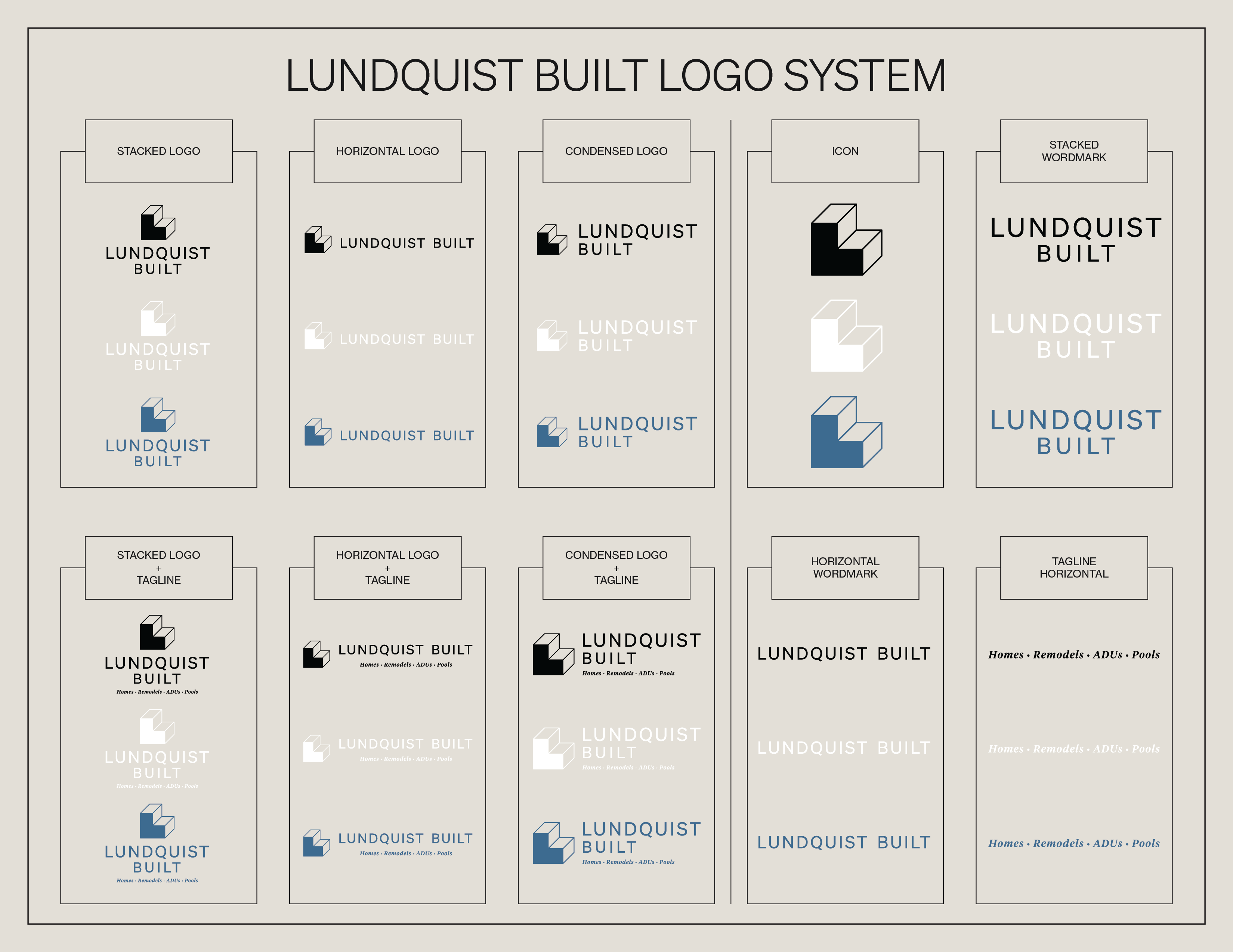
Lundquist Built is a California licensed general contractor based in San Clemente, building refined residential projects across coastal Southern California.

Source: fonts.google.com/specimen/Inter

Web fallback: system-ui, -apple-system, "Helvetica Neue", Arial, sans-serif

Hierarchy reference

Site-wide typographic hierarchy. Wordmark settings (Söhne / Tiempos with locked tracking values) are defined in the logo section above — they don’t belong in this table because they only appear inside the lockups.

RoleFontWeightNotes
H1 — hero, page titlesFraunces (font-display)300 Lightclamp(2.75rem, 5.5vw, 4.5rem); tracking −0.015em
H2 — section headersFraunces (font-display)400 Regularclamp(2rem, 3.8vw, 3rem); tracking −0.01em
H3 — subsectionsInter (font-body)600 Semiboldclamp(1.5rem, 2.4vw, 2rem); tracking −0.005em
H4–H6 — minor headingsInter (font-body)500 Mediumsized per context, default tracking
Body paragraphsInter (font-body)400 Regular1rem default; line-height 1.55
UI / button textInter (font-body)500 Medium+0.01em tracking on .btn
Caption / small textInter (font-body)400 Regular0.78–0.875rem
Eyebrow labelInter (font-body)500 Mediumuppercase, +0.18em tracking
Tagline / accent italic (outside logo)Fraunces Italic (font-display)400 Italicused sparingly for editorial accents

The rule: Wordmark fonts (Söhne, Tiempos) are LOCKED to logo use. For every other typographic need — body copy, headings, marketing material, signage, embroidery wherever Söhne isn’t required — use Fraunces and Inter.

Voice & tone

Direct. Refined. Never salesy.

Voice attributes

Direct, refined, technical when needed, transparent, never salesy. Blake’s voice — a confident craftsman who explains his work honestly. Avoid construction industry clichés (“we build dreams,” “your vision, our craftsmanship”) and avoid corporate-stiff language.

Cost-plus copy rule

In all client-facing copy, the cost-plus structure is described as “20% margin, 1.25× multiplier” — never as “markup.” The markup framing is technically correct but emotionally registers as a higher number than the margin framing for the same dollars. Internal / contract / accounting documents can use all three terms (margin / markup / multiplier) for precision; external copy uses margin + multiplier only.

Example phrasings

Every dollar of project cost gets multiplied by 1.25 to determine your price.

We work on a 20% margin — exactly what you’d expect from a refined custom builder.

My fee is 20% of the total contract.

We mark up costs by 25%.

Industry-standard 25% markup.

Photography

Architectural. Natural light. Editorial composition.

Style

Architectural, natural light, residential focus. Think Architectural Digest and Dwell — clean, considered, editorial.

Subject matter

Construction process, finished work, craft details, materials, hands at work, finished interiors and exteriors.

Color

Natural and warm tones — temperature should sit naturally against the Warm Cream backdrop. Avoid aggressive blue casts from cool LED panels or harsh shadows from on-camera flash.

Avoid

Harsh flash, busy compositions, unstaged “in-progress with debris everywhere” shots (unless the project context calls for it — a process narrative beat, not a hero image).

Digital specs

Reference dimensions for common digital applications.

ApplicationDimensionsUse
Instagram profile320 × 320 pxIcon (primary)
Instagram post (square)1080 × 1080 pxStacked Logo, ample padding
LinkedIn company logo300 × 300 pxIcon (primary)
LinkedIn cover image1128 × 191 pxHorizontal Wordmark, navy on cream
Website favicon32 × 32 pxSmall-format solid icon
OG image (when needed)1200 × 630 pxStacked Logo + Tagline on cream
Email signatureinlineHorizontal Wordmark + contact details below
Downloads

All brand assets in one bundle.

Logo lockups, icon variants, wordmarks, color swatches, and font license references — packaged together for vendors and partners.

Download brand bundle (.zip)

Asset bundle coming soon — email blake@lundquistbuilt.com for individual files in the meantime.

Contact

Brand questions, asset requests, licensing.